


New Look is "Young and Energetic" According to Kia
The fact that Americans only started to get to know Kia and its products ten
 |
| Kia's new logo is only part of its completely updated corporate identity. Note: Click on photo album link below for more images. (Photo: Kia Motors America) |
Gone is the white oval, the bold KIA letters and bright red background of the current logo, replaced by a white background surrounded by a "richer, deeper red" oval, and matching three dimensional red typeface (color code: M100Y100K30), says the Korean automaker. The new logo is only part of a completely updated corporate identity, which also includes a new look
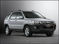 |
| The upcoming Sportage compact SUV will be the first to sport Kia's updated logo. Note: Click on photo album link below for more images. (Photo: Kia Motors America) |
Kia will be one of smartest looking franchises when it all takes effect, with its retail stores and signage taking on contemporary design details in glass and brushed aluminum, which should appeal to the automaker's customer younger demographic.
Currently there are different Kia logos being used in different world markets, therefore a consolidation was needed. The new corporate identity will phase in gradually, with the brand's 3,000 distributors and dealers throughout the world replacing old signage and then remodeling their dealerships.