

In recent months, it’s been repeated as nauseum that the automotive industry is undergoing profound changes, notably with its shift toward electrification. Vehicles are changing, manufacturers' philosophies are changing and our habits are about to change as well.
There's another thing that's been changing a lot for some time too: automakers’ logos. We've seen firms make minor changes, like BMW and Volkswagen, for example. Kia has just made a major change and Nissan has refreshed its image as well.
Add GM to the group. The American giant has indeed made some pretty important changes, all in the service of updating its image.
See also: Generation E: General Motors' New Vision
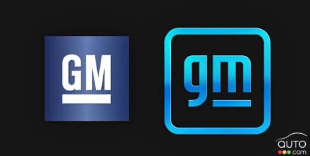
The letters are the same as before, but that's all that remains unchanged. The blue square framing white underlined and capitalized GM letters has been the image of the brand since 1964. The logo has undergone some slight refreshes with minor changes in shades, especially in the early 2000s and again at the start of the 2010s, but the vast majority of people probably don't even remember a time when the GM logo is not the one we know.
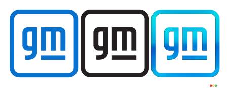
The new logo, which is being pressed into action as of right now, has three different styles: a gradient blue, a solid blue and a solid black. The first blue appears to be the one that GM will use most widely. All three have the same design, with a white background, a square shape with rounded edges, and lowercase letters with only the "m" underlined.
Discover Shopicar! All new makes and models and all current promotions.
GM says it has redesigned its logo to revitalize its brand image for the new digital era ahead. It is under the banner of this new image that the automaker intends to launch a flurry of new electric vehicles over the next decade. Here's how GM describes its new logo:
The new GM logo features a color gradient of vibrant blue tones, evoking the clean skies of a zero-emissions future and the energy of the Ultium platform. The rounded edges and lower-case font create a more modern, inclusive feel. The underline of the “m” connects to the previous GM logos as well as visually representing the Ultium platform. And within the negative space of the “m” is a nod to the shape of an electrical plug.
- General Motors
The change is significant, unlike VW’s mild tweak, for example. It might take time but folks will get used to it. At first glance, the use of lowercase letters gives less authority to the acronym, but the transformation is understandable. We'll see how it will be received.
In any case, it’s worth remembering one thing: the GM logo is not found on any GM vehicle – a rarity in the trade. So on a daily basis, similarly to the recently unveiled Stellantis logo, no consumer will really be confronted to it.